Friends, Readers, Romans, welcome to another Toonstack. Per the rules of Toonstack (which are unflinching and severe) we rotate editors each week, and this week it is I, Navied, at the helm. Like most people, you probably laid awake last night thinking about cartoons and cartoonists (quick: murder, boff, kill--Steig, Barsotti, Hokinson?). You’re likely still tossing and turning wondering how in the world cartoonists go from first draft to final draft. This week on Toonstack I’ve asked my fellow cartoonists to write a little bit about their process from first to final, because unfortunately, there isn’t some cartoon fairy who places finished toons under our pillows at night (horror film idea—“The Cartoon Fairy: You’ll Laugh Until You Die!”).
Ellis Rosen
Some ideas come right away, you draw it and say, “Well well, I guess I am a genius, huh?” to which your goldfish says, “That kind of egotistical attitude is why you're talking to a goldfish instead of making real friends.” Other cartoons are more of a fight. A fun fight. You know, like, ”Ow! You punched me in the face! Ha ha!” The following is one such cartoon that started somewhere completely different than where it ended up.
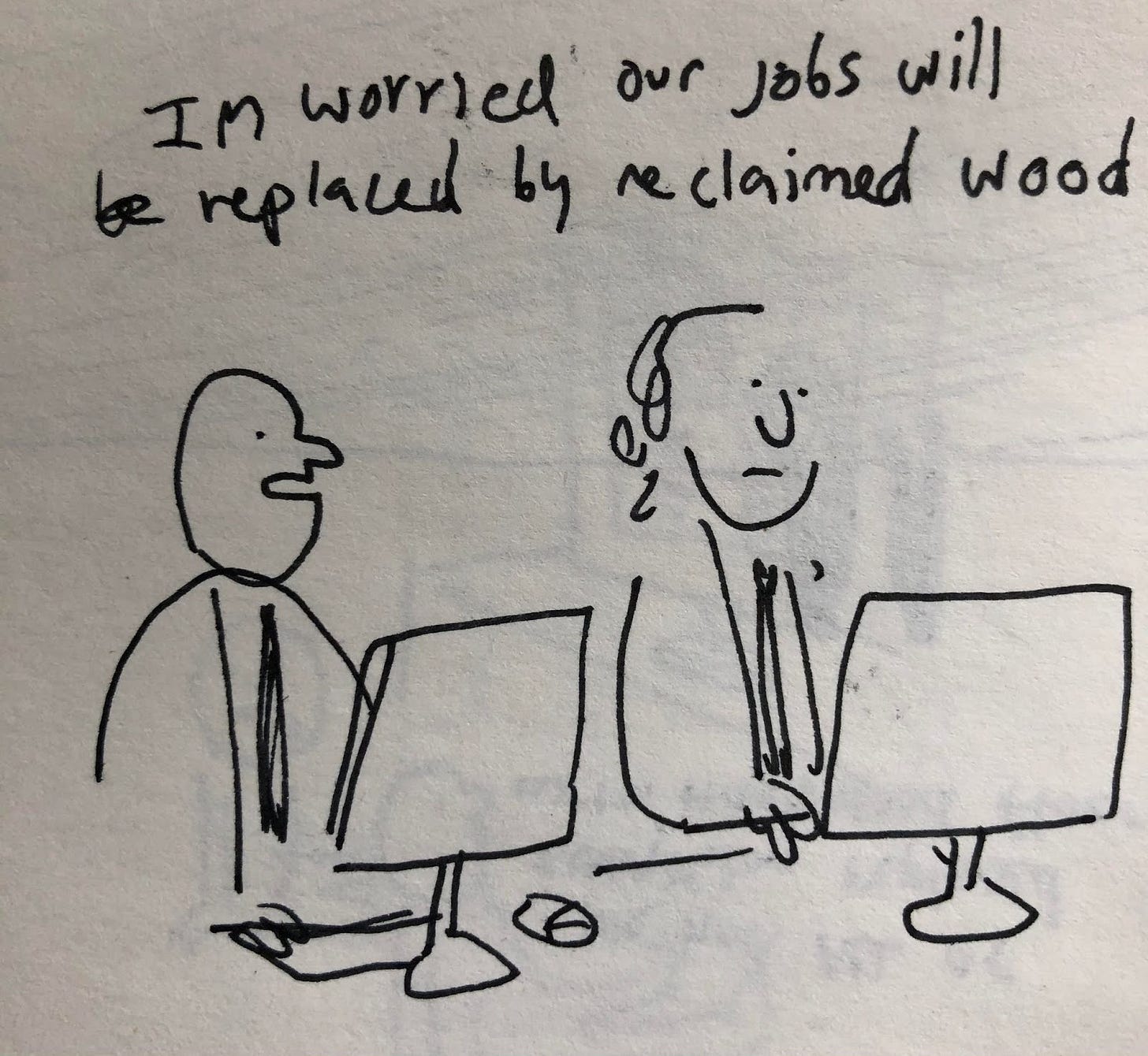
Here is the initial idea. It’s supposed to be a classic “employees being replaced by technology” but sort of mashed up with the idea that people like hardwood floors. It’s great except for one problem: It doesn't make sense. Also it had another problem! it doesn't feature wood floors in the drawing! Here’s a good rule: the subject of your joke should probably be in the picture.
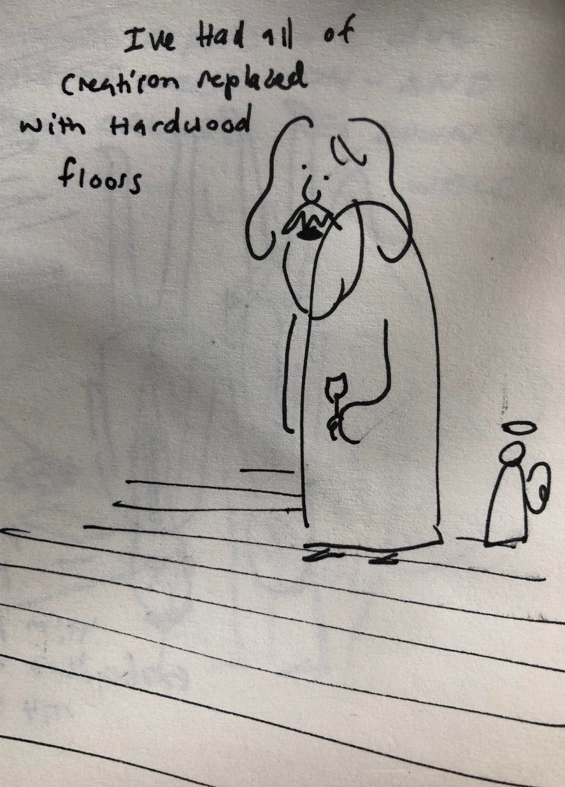
So with that in mind, here’s strike two: You may have noticed that I added floors to the drawing. However, I forgot about the “Doesn't make sense” part.
I decided I should think bigger. Why stop at employees? Maybe these CEO types would get hardwood floor fever and replace literally everything. They probably could afford it. Not sure why I went from reclaimed wood to hardwood. I guess I thought “hardwood” was more ubiquitous. For whatever reason, I still overlooked the making sense part.
I decided that if this was going to be a good cartoon, it was going to have to make sense. It was a bold thought, I know, but it had to be done. So I asked, “who actually has the power to turn everything into hardwood floors?” to which my goldfish responded, “God, you schmuck”.
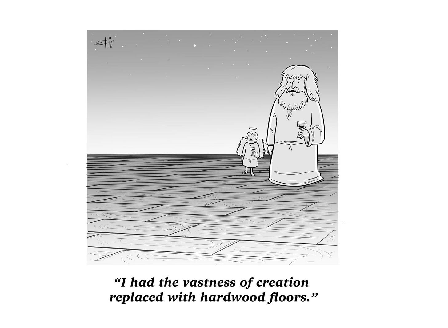
Deeming this make-sense-y enough I drew this final. My friend Benjamin Frisch suggested I add “vastness,” which really brings the cartoon home. Not sure it would have sold to the New Yorker without that word. Thanks Ben! In return you can have my goldfish! He talks, but he’s a real jerk.
Sofia Warren
Unfortunately for me, I inherited a Puritan work ethic: somewhere way deep down, in a place too primal and obscure for my politics or conscious thought to permeate, I believe that nothing effortless can be good. If you didn’t sweat blood and lose hair in the making of it, I don’t want to see your work. . . and neither, I might add, does The Lord. The Lord will not be inviting you to His pool party in the sky.
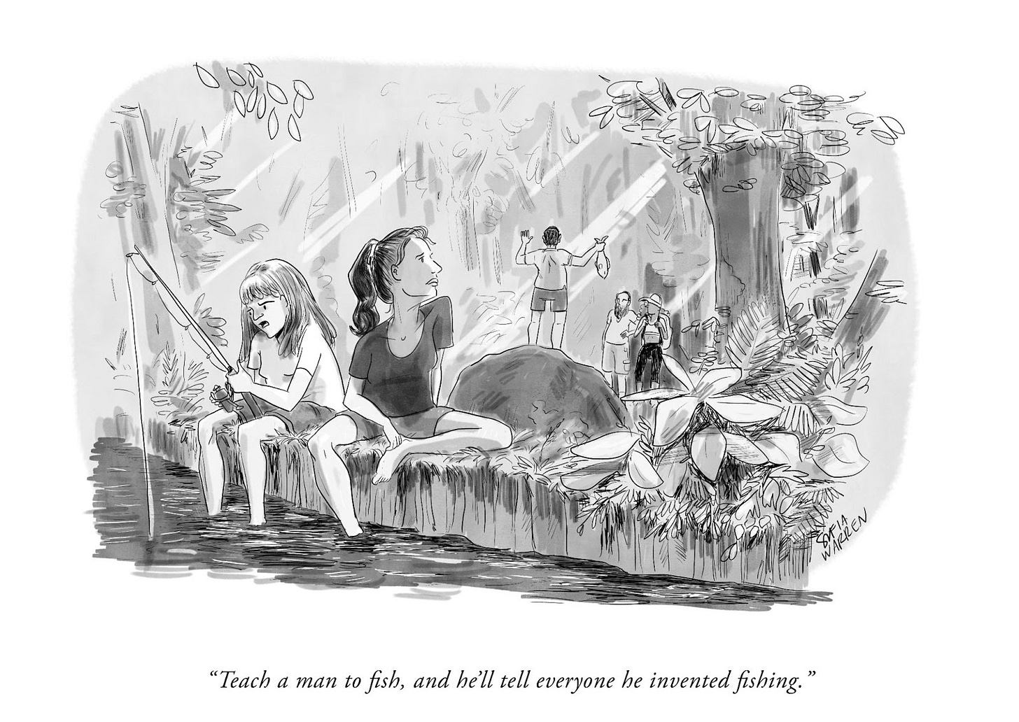
The trouble with this belief is that I wind up with stuff like this, where the rough draft is full of energy, and the final is overwrought and sort of cold. Like, what’s with all those individual leaves? Who cares? Anyway, don’t worry: I’ve been working on it—making this dashed-off advice column each week helps— so I’ll be seeing you all in Hell.
Drew Panckeri
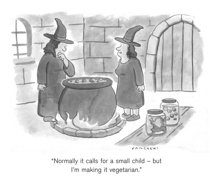
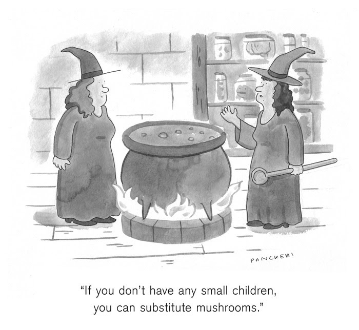
Rarely ever do I go back to old cartoons and attempt to improve them. I know what doesn’t need polishing, this cartoon however is an exception. I didn’t decide to revisit it because I thought it was especially good, or it had potential to be improved, but because I totally forgot I drew the original version.
A few weeks after the initial cartoon was rejected I was eating a plate of pandemic pasta and watching Ina Garten talking about making her Ragu, when she mentioned substituting mushrooms for the vegetarians out there. A couple hours later I was sitting and aimlessly scanning my brain for something (please lord, anything) that might give me a starting point to something funny and WHAM, my subconscious threw together the old witches, peppered with Ina’s advice and *chef’s kiss*.
Kendra Allenby
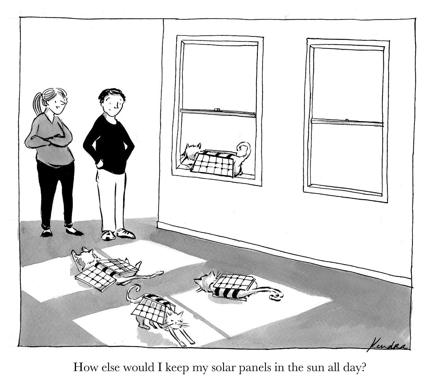
Yay! I sold a cartoon. But uh oh, they’re in a totally blank room whose walls don’t make sense. Let’s give them a couch. And put a cat on it! How about an end table and a book? This table might tip over, but I guess the couch is holding it up? My friend Corey told me nothing says “this is a house” like lightswitches and hardwood floors. Hardwood floors would draw attention to the wonkey perspective so lightswitch it is. And an outlet! Do we need white ponytail lady in her boring sweater to be the one saying the line? Nope, we don’t. Mmm, we can also do something about the creepy blank windows...like weird fluffy cloud trees! Perfect. Oh, and nothing says “this is a fully thought out background” like a framed picture. Of mountains.
This 2018 cartoon isn’t stylistically how I’m drawing now, but the process for “fully thought out backgrounds” hasn’t changed much.
Sarah Akinterinwa
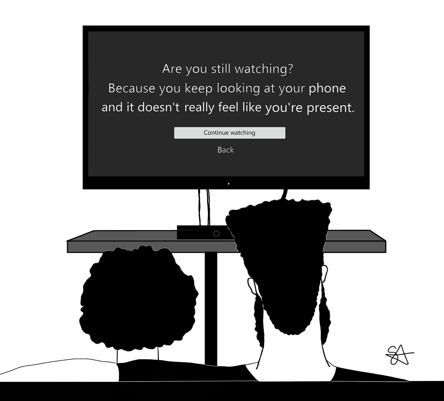
My creative process is very much all over the place. I find it embarrassing when people watch me draw because it involves a lot of scribbles and strange shapes that only I can make sense of. I don’t have first drafts, I go straight into it! My ideas are a list on my iPhone notes app of things I’ve found funny recently. I then have to find a way of weaving them into scenarios of my cartoon Oyin and Kojo which is always a fun challenge. When I made my Netflix cartoon, I was working on another cartoon and had Netflix playing in the background. Suddenly that passive aggressive “are you still watching” message popped up which I interpreted as, “do you even have a life?” or “are you even paying attention?” So I decided that it had to be my next cartoon. Also a subtle dig at Netflix.
Navied Mahdavian
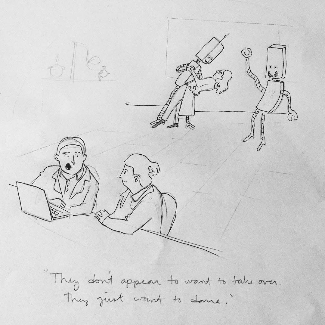
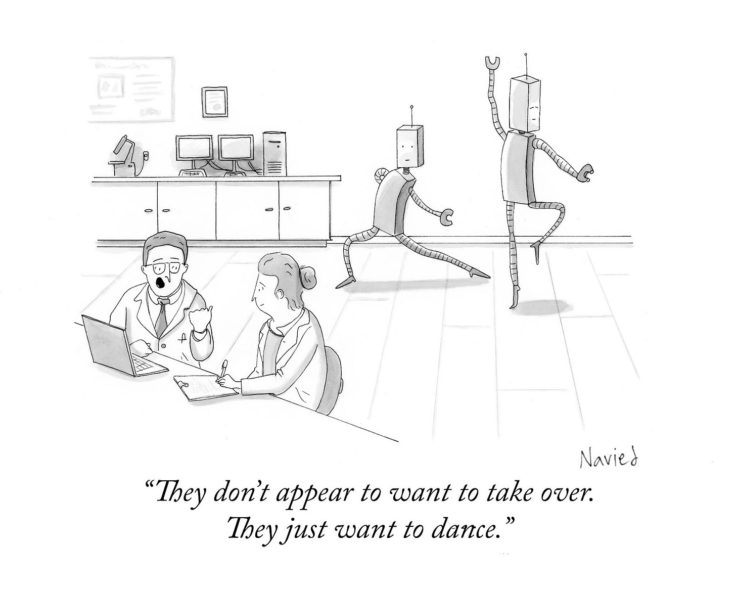
Some cartoons work because of a great caption. Some because of a great image (and some still, because of both). I think this one falls into the latter category.* The joke only works because of the exaggerated expressiveness of the two dancing robots. My first attempt at robots dancing is not funny--goofy sure, but not funny. Not being a dancer myself (though I think I could have been a great one), I used Audrey Hepburn dancing in the brilliant Funny Face as inspiration (a point of reference I return to often). Dipping your partner isn’t particularly funny, but lunging sure is.
I drew this cartoon in 2018 and have since learned that scientists don’t usually wear lab coats (a Jurassic Park T is preferred). I didn’t know this, not being a scientist myself (though I think I could have been a great one).
*The now defunct website, Cartoon Companion, which graded New Yorker cartoons, called the composition “contrived.”
Hilary Campbell
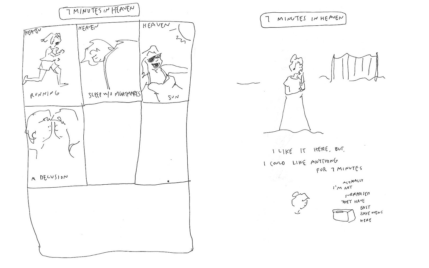
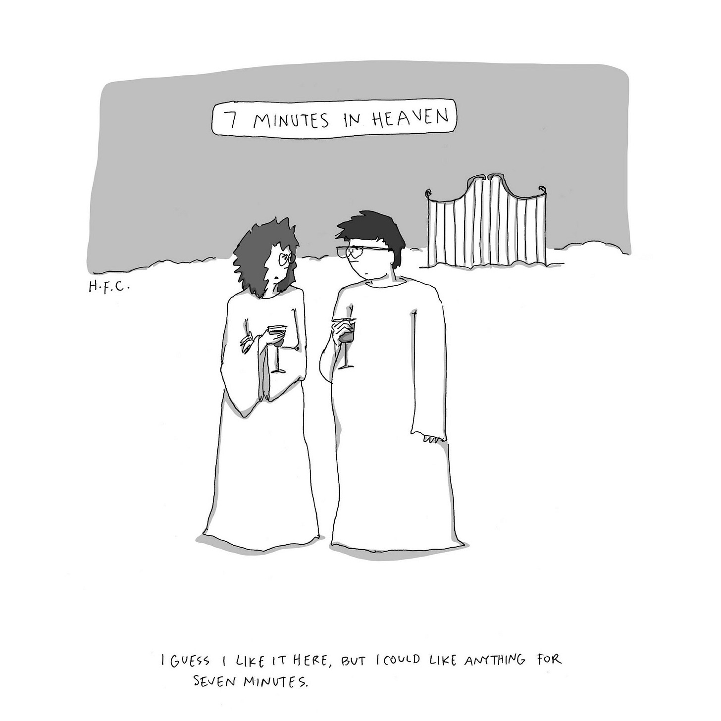
Like many cartoonists, every gag I draw comes from some initial idea that I have to work through in my head. Sometimes it’s something I heard or said that I thought was funny, sometimes in an image and I need to find the line, or sometimes it’s a common phrase we all use and I’m trying to turn it on its head. So here I am *clearly* working through the concept of 7 Minutes in Heaven. What does it mean, to me, Hilary Campbell? Apparently at some point I thought it was a place with an easy bake oven. Which is hilarious by the way—now I want to go draw more about that. But ultimately I landed on the idea that 7 minutes just really isn’t that long, and I always think I like something initially… before I have time to figure out what I can complain about. So literally seven minutes in heaven… is probably pretty chill?
Jeremy Nguyen
Here’s why I was meant to make single-panel cartoons. This cartoon actually began as an idea for a long-form prose piece. I wrote a long list of embarrassing facts about myself that I’d fictionally sell on Craigslist, for $50 each OBO. When I got no offers, both for the essay and thus the data I wrote, I sketched it as a single panel cartoon. My first draft of this cartoon was a bit messier and less controlled. In 2018, I was converting my workflow to digital and learning new tools on the iPad. Everything I drew back then in my transition phase had a bit of charm to them, but I still preferred clean, dead lines. The deader the better.
After receiving some feedback from my editor, we decided to take some words off the signboard and create a caption. Color was introduced when Wired bought and published it as an online daily cartoon. I pulled the palette together from Wired’s own website menu design. And boom, it finally worked and I was able to sell my data. This one lonely idea has seen many different iterations over the course of a year, but it finally became a single image: the form it was meant to take. And now I sell all my data this way!
Amy Kurzweil
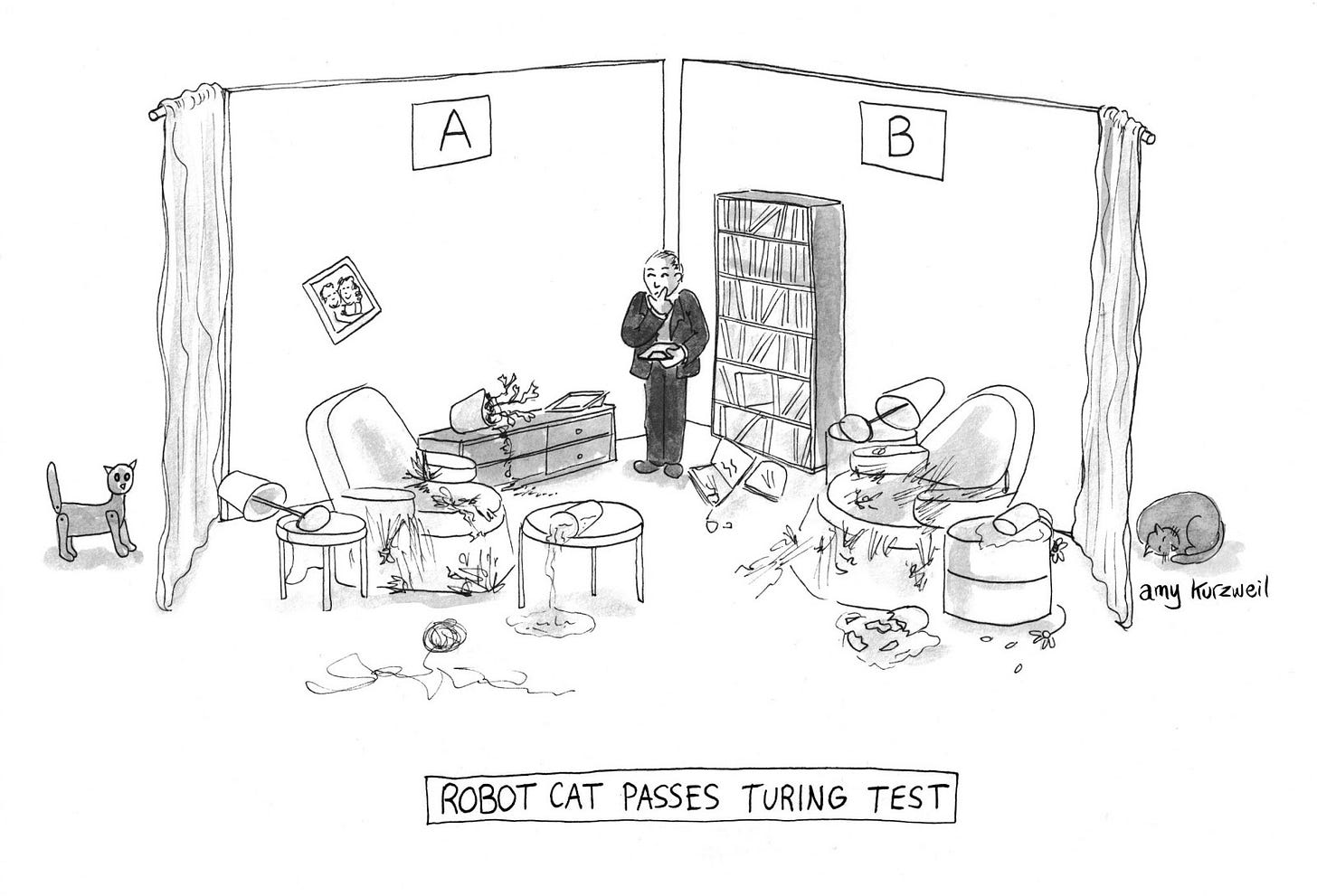
Oh god. Even trying to explain what I was thinking here is an uncomfortable dive into the mess of my mind, which looks like this room, my first try at depicting a Turing Test site for cats. I have a tendency to get distracted by trying to understand things as precisely as possible (what exactly did the room in Turing’s conception of the “imitation game” look like? Were there curtains? I bet there were curtains...) which sometimes results in me missing the point.
There’s way too much going on in this image. But also, I was confused about what is actually funny about cats. I showed this cartoon to Bob Mankoff, then editor of The New Yorker, and also to Liana Finck, cartoonist extraordinaire. Both of them were like… Don’t cats, just, not really do anything at all?
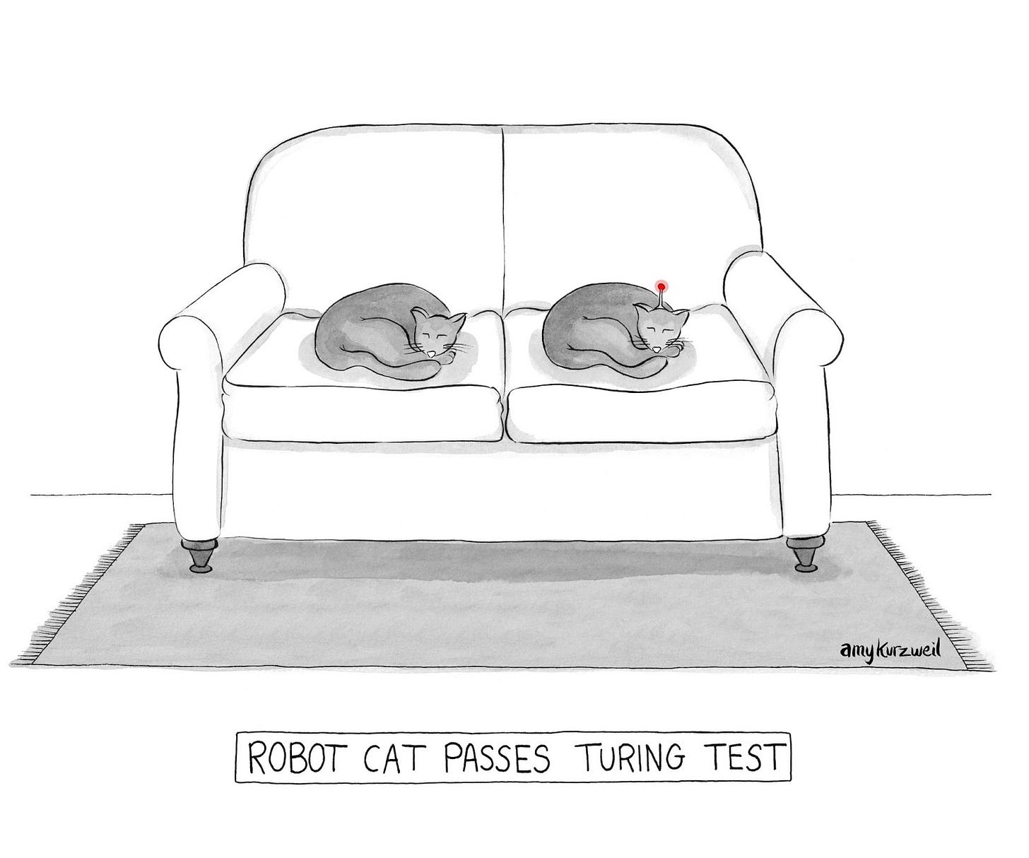
I won’t show you all the versions (cat with robot eyes, cat with plug), but here’s where I finally landed. This was published in the New Yorker in 2016.
Instead of trying and failing to wrap my head around the nuances of a thought experiment from 1950, I just made a joke about cats. Cats are funny cuz they, like, just sit there. It’s hilarious.
Johnny DiNapoli
For me the caption usually comes first, and that’s what happened here. This first sketch was kind of cute, but there was too much “vichyssoise” and not enough “plot.” Playing with mystery tropes and images, I landed on the idea of adding footprints to the scene. With the black footprints on the bottom right, I wanted to balance it out with black on the top and left, leading to the black ladle and pot. I like how that inking tied the “plot” and “vichyssoise” together visually. Also: I’ve never tried vichyssoise? Is it good? Anyone have a recipe?
Shelby Lorman
Because all of my cartoons look the same and I mostly draw circles, there is not a very dramatic reveal here. But maybe because of this, my first “drafts” are even less structurally sound than the complete ones—I jot words or phrases or ideas down in odd places. Then later I go on an expedition and try to unearth what I meant by anything, which I never can figure out—recently I found the phrase “dads—meetings?” circled a lot in a notebook. Genius stuff! It creates this surreal back and forth between past me and current me, over the span of many years. I also usually make my first drafts very small—I love a good index card or napkin. Something about the size relieves the pressure of it being a first draft. It’s like: this is truly being workshopped, no notebook, put this idea in your pocket for a while.
Sometimes the first draft is loosely based on an event and the final is the rendering. For instance the spread below is based on an extremely important event, in my life and hopefully now yours, which is when my aunt made her Facebook status simply: pppppp.
It has haunted me for many years, and when I was working on my book it really did not seem like a wise choice to include three pages (and page count was tight!) to my interpretation of the ppppp haunting. Thematically it has very little to do with anything. But we did it, Joe!
For Your Pleasure: Cartoon Extras
Follow Kendra Allenby as she walks the Continental Divide Trail for 5 months!
Amy Kurzweil’s has a Patreon. Join her Creative Community and bring your mom!
Enjoy diary comics from Hilary Campbell on Patreon!
Be sure to check out Shelby Lorman’s newsletter, Please Clap!
The same goes for Sofia Warren’s advice newsletter, You’re Doing Great!
See more cartoons from Ellis Rosen’s weekly Junk Drawer!
Check out Drew Panckeri’s new website!


